
We first published these rules in 2018, when conversational UI design meant scripted chatbots, button menus, and the occasional voice skill. Since then, the underlying technology has been replaced wholesale, and the surprising part is how little of the design canon needed to be replaced with it. Twelve of the original thirteen rules survived the LLM era; one didn't, and we've retired it. This is the updated version, covering what conversational UI design means now, what actually changed, and the thirteen rules we'd hold any production assistant to in 2026.
What Is Conversational UI Design?
Conversational UI design is the practice of designing interfaces where the primary interaction is dialogue (typed or spoken) rather than buttons, menus, and pages. The designer's material isn't layout; it's turns, wording, timing, and recovery. As our conversation design guide puts it, language is dynamic, and each interaction is unique, shaped by context, intent, and user behavior, which is why conversational interfaces can't be specified as exhaustively as a screen can.
The original version of this post was built on Ben Shneiderman's eight golden rules of interface design, compiled in the 1980s, alongside the usability traditions of Don Norman and Jakob Nielsen. That lineage still holds. Good conversational UI design is mostly a classic HCI discipline applied to a medium that talks back.
How Conversational UI Design Has Changed in the LLM Era
The 2018 version of this post assumed the designer scripted every path. The system understood only what it was trained to expect, so design meant anticipating inputs and laying happy-path rails. Large language models flipped the constraint. Understanding varied phrasing is much easier than it was in the scripted-bot era, and the design problem moved downstream.
Three shifts matter most for working designers:
- From input anticipation to output governance. You no longer spend your weeks enumerating phrasings. You spend them deciding what the system is allowed to say and do, because a generative model will otherwise improvise policy, prices, and promises. Design now includes guardrails.
- From single-path scripts to repairable conversations. Real users interrupt themselves, change topics, and come back. Recovery is now a first-class design surface, and the patterns that re-ask, clarify, or guide users back to the original task when they backtrack belong in the spec, not in a bug tracker. Whatever stack you use, recovery behavior is now designed, not patched.
- From chat-only to voice parity. Voice interfaces add turn-taking, interruption handling, and latency to the design brief; pauses that read as fine in chat feel broken on a phone call. Designing once for both modalities is increasingly the default expectation.
What didn't change is the human side. Users still need consistency, feedback, closure, reversal, and a way out. That's what these rules are for.
Rule 1: Strive For Consistency.
"Consistent sequences of actions should be required in similar situations; identical terminology should be used in prompts, menus, and help screens; and consistent color, layout, capitalization, fonts, and so on, should be employed throughout. Exceptions, such as required confirmation of the delete command or no echoing of passwords, should be comprehensible and limited in number."
Rule 2: Seek Universal Usability.
"Recognize the needs of diverse users and design for plasticity, facilitating transformation of content. Novice to expert differences, age ranges, disabilities, international variations, and technological diversity each enrich the spectrum of requirements that guides design. Adding features for novices, such as explanations, and features for experts, such as shortcuts and faster pacing, enriches the interface design and improves perceived quality."
Rule 3: Offer Informative Feedback.
"For every user action, there should be an interface feedback. For frequent and minor actions, the response can be modest, whereas for infrequent and major actions, the response should be more substantial. Visual presentation of the objects of interest provides a convenient environment for showing changes explicitly."

minor feedback in WhatsApp through checkmarks indicating the read status of messages

visual feedback by Google Assistant

major feedback from a bot
Rule 4: Design Dialogs To Yield Closure.
"Sequences of actions should be organized into groups with a beginning, middle, and end. Informative feedback at the completion of a group of actions gives users the satisfaction of accomplishment, a sense of relief, a signal to drop contingency plans from their minds, and an indicator to prepare for the next group of actions. For example, e-commerce websites move users from selecting products to the checkout, ending with a clear confirmation page that completes the transaction."

bot explains the steps ahead and divides them into blocks

bot closes one block of actions and opens another

an interaction is closed with a reminder to make the user feel safe that they have taken all necessary steps
Rule 5: Prevent Errors.
"As much as possible, design the interface so that users cannot make serious errors; for example, gray out menu items that are not appropriate and do not allow alphabetic characters in numeric entry fields [...]. If users make an error, the interface should offer simple, constructive, and specific instructions for recovery. For example, users should not have to retype an entire name-address form if they enter an invalid zip code but rather should be guided to repair only the faulty part. Erroneous actions should leave the interface state unchanged, or the interface should give instructions about restoring the state."
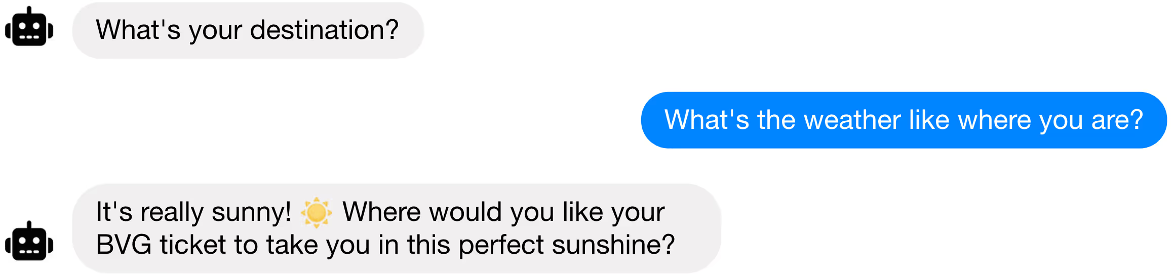
bot gently keeps user on the happy path
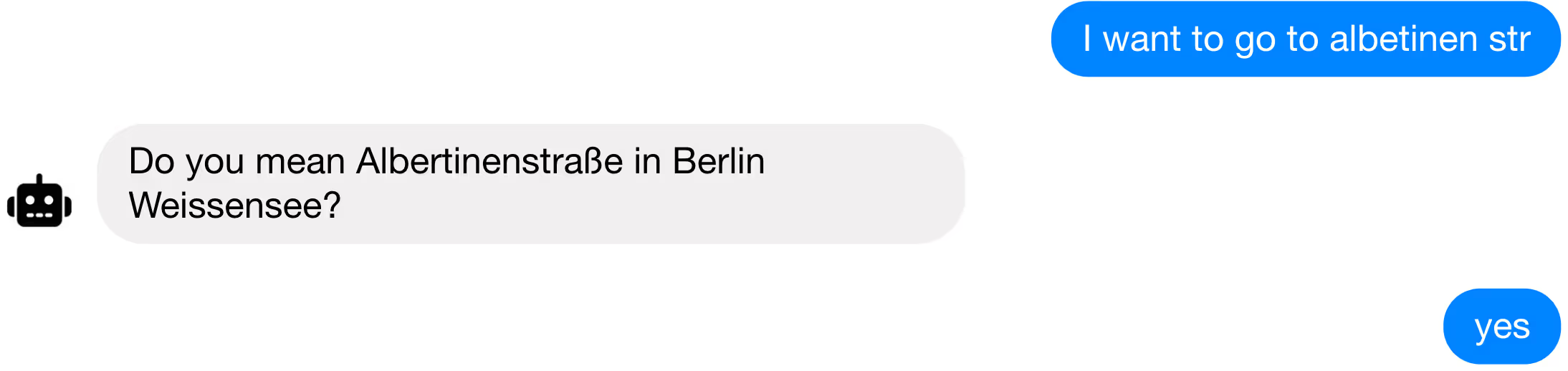
bot corrects error by confirming input with user
Rule 6: Permit Easy Reversal Of Actions.
"As much as possible, actions should be reversible. This feature relieves anxiety, since users know that errors can be undone, and encourages exploration of unfamiliar options. The units of reversibility may be a single action, a data entry task, or a complete group of actions, such as entry of a name-address block."
Rule 7: Let The User Know What They Are Doing.
Especially experienced users strongly desire the sense that they are in charge of the system and that the interface responds to their actions in the way they expect it to. To feel in control, the user needs to know the system status and what to do next. Make the options and paths available to them visible and clear.

a map to interact with is familiar makes it very clear what the user needs to do
Rule 8: Reduce Short-term Memory Load.
"Humans' limited capacity for information processing in short-term memory (the rule of thumb is that people can remember "seven plus or minus two chunks" of information) requires that designers avoid interfaces in which users must remember information from one display and then use that information on another display. It means that cellphones should not require reentry of phone numbers, website locations should remain visible, and lengthy forms should be compacted to fit a single display."
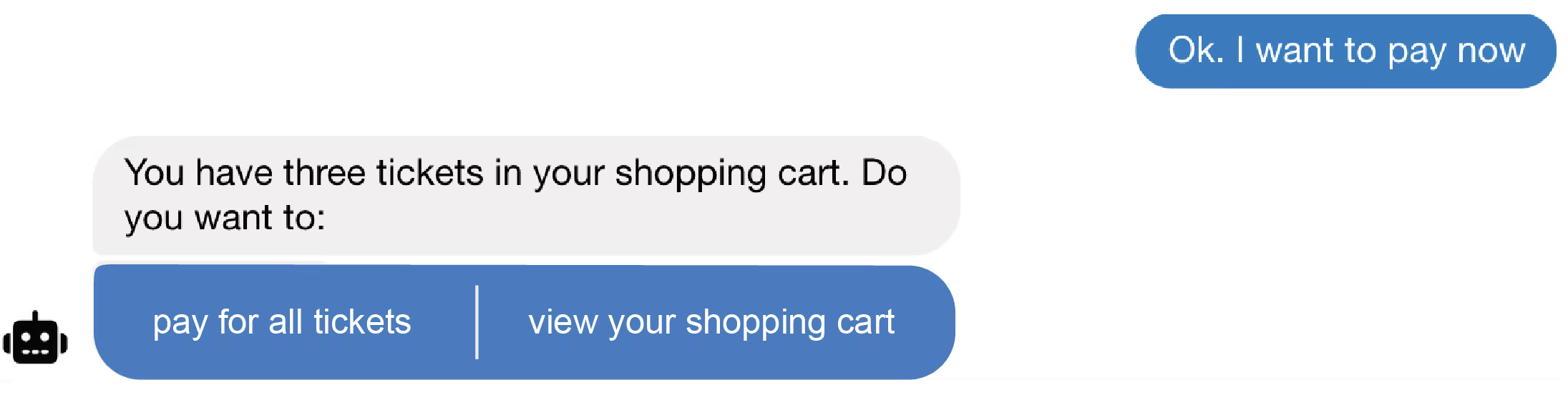
have the system remember things for the user
Rule 9: Have The System Adapt To The Individual.
Provide the optimal amount of information needed for the shortest path to reach the user's goal. Give explanations if needed, but also make shortcuts available for experts. Avoid requesting user input if possible. Personalize the experience for users as to make it as pleasant and accessible as possible for them.
Rule 10: Make Help Readily Available.
Ideally, an interface should be easily operated without documentation, but under certain circumstances, it can be necessary to explain elements of a system. In these cases, help and documentation should be readily available, accessible and relevant to the situation at hand. Take care to make viewing the documentation optional, as more experienced users will find it to be frustrating to be confronted with information they do not need.

use a combination of slash commands and key words to make help relevant
Rule 11: Have A Fallback Option.
A fallback option for any interface is essential in case of malfunction or if the system fails to deliver the desired outcome for the user. It is extremely irritating to be unable to accomplish a task with an interface and have no alternative way to do it. Hopefully, the fallback option should not come into action often, but when it does, it needs to be actionable and accessible so the user does not feel lost and can still fully accomplish what they set out to do.
Rule 12: Make Use Of Familiar Concepts.
Recognizing something is always easier than learning something new and takes much less attention and mental energy. Pay attention to the context the user is in and avoid making them have to think about how to operate the interface. An interaction with an interface should be shaped around how humans work. Make users feel confident and safe in their actions by keeping them on familiar ground.
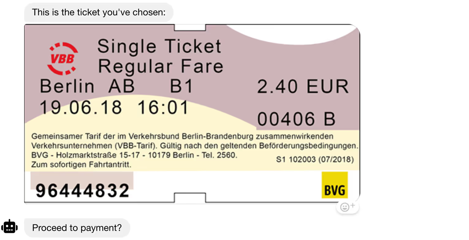
a visual representation of a train ticket helps users recognize immediately what is going on
Rule 13: Minimize Distractions.
Keep the user's focus on the task at hand. There should not be too many elements competing for their attention. Don't burden the interaction with irrelevant or rarely needed elements or information. Keep clutter to a minimum. Design the interface to be unobtrusive, but appealing to use.
Additionally, it is always helpful to take a step back and consider what interface will really serve the purpose best and whether maybe there is a way to accomplish it without any interface at all.
Conversational UI Design Examples
The fastest way to internalize the rules is to see one applied and violated in the same scenario.
The dead-end version answers "I didn't understand that" twice, then repeats the main menu, violating rules 3, 11, and 13 simultaneously. The designed version acknowledges the change in topic, addresses it, returns to the original task, and offers a human exit. Neither version requires better AI; the difference is entirely in design.
For a library of full conversation patterns (support, onboarding, purchase, feedback) with the design reasoning behind each, see our collection of chatbot flow examples, and for the step-by-step craft of building them, the guide to designing chatbot conversations.
One discipline ties all the examples together: testing with real users before launch. The approach we documented from the Danish Digital Library's chatbot project still holds up. Five test participants is a workable rule of thumb, Wizard of Oz prototypes work before any code exists, and, as that team put it, when a participant struggles, "it is convenient to dismiss a broken user, rather than a broken design." Our guide to usability testing for AI assistants covers the full method.
Tools for Designing and Building Conversational UIs
Design rules only matter if your platform can enforce them. Three capabilities to look for, whatever you build on:
- Design that non-engineers can own. Conversation designers should be able to build, test, and revise agent skills directly. Rasa Studio, for example, pairs a no-code builder with a testing panel for trying the agent as you design.
- Designed recovery, not improvised recovery. Rules 11 and 13 need platform support, the built-in patterns that re-ask, clarify, handle digression, and guide users back on track when they backtrack, the way our conversation repair does without custom code.
- Guardrails as architecture. Rule 5 at scale means separating understanding from the rules that decide what happens, so the persona can be fluent while the behavior stays inside policy.
For chat-vs-voice tradeoffs in tooling, our voicebots vs. chatbots comparison breaks down where each modality earns its complexity.
Design Your Next Conversational Interface with Rasa
The 2018 closing advice still applies. Step back and ask whether there's a way to accomplish the task without any interface at all. When it is, these thirteen rules are the difference between an agent that demos well and one that survives real users. They're also easier to follow on a platform that treats skills, recovery, and guardrails as designable objects rather than code.
You can try the design experience directly. Hello Rasa lets you test-drive a conversational agent, and the free Developer Edition gives you the full Rasa stack to build with. If you'd rather see the rules applied to your own use case, talk to our team.




.png)